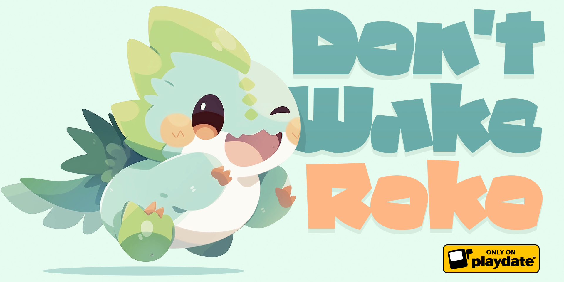
Don't Wake Roko
🧳 Exploring Typography
I’m not a fan of super wordy games. I wanted to keep dialogues and copy to the minimum. The default fonts on the Playdate are pretty clear and legible. And easy to implement.
But I wanted a look and feel with a bit more personality. Being a big fan of 80s-era Apple or Game Boy games, I started with idleberg’s Playdate Arcade Fonts collection.
Some wonderful gems there but designing for Playdate is slightly different than classic pixel art: the screen dimensions are somewhat similar to the Game Boy but the pixel density is way higher. Donald Hays wrote a great article about this.
If you design for Playdate at the scale you would for retro systems or retro-style games, you may accidentally make art that’s uncomfortably small when viewed on the screen.
Donald Hays, Playdate Art: Scale
How small is too small?
Characters under 14px were not going to work for me so I decided to look for bigger, more legible, font faces. That’s when I came across Eas VHS on Dafont. Also a pixel font but made to be used at 17px. Clean, easy to read, it was a great candidate with a nice subtle retro flavor.
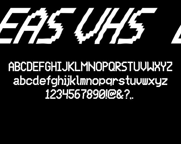
It was also remarkably similar to the system font of the crank.
Default Font
Eas VHS 17px
Titles with character (yes it's a pun)
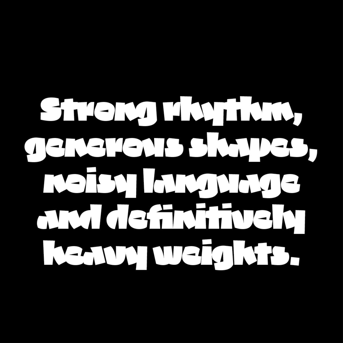
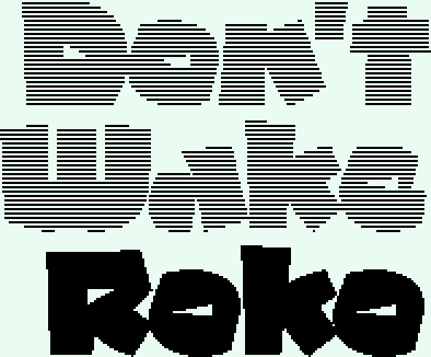
For the logo, I wanted something with some personality. Bold and warm. After a few tries with sci-fi fonts, I decided to go with a slightly different approach. While I really love classic typefaces like Futura, I eventually chose a less expected typeface called Grenat by French graphic and typeface designer Theo Guillard. Its iconic black weight works wonder for display uses and logos
Color Version
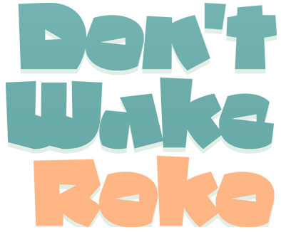
1-bit version
Leave a comment
Log in with itch.io to leave a comment.