🏃➡️ Pushing Pixels
Another challenge involved deciding whether to animate elements programmatically or 'manually.' While animation through code often appears more elegant and efficient, it can be daunting for novices. We are venturing far beyond the comfort of the WYSIWYG world.
Hybrid approach
For me, it ended up being a blend of various techniques. I used Pixaki for pure traditional, frame-by-frame, animation like those run cycles or the door explosions. Excellent technique for a sharp, pixel-perfect look. But everything has to be drawn almost one pixel at a time. Tedious but also somewhat relaxing. A happy meditation, if you ask me.


Hand-drawn tables, a labor of love
For the intro and the game-over screens, I opted for After Effects, finding it more convenient for animating large areas and adding visual effects and animation curves. The main challenge was maintaining the pixel art aesthetic and avoiding mushy, fuzzy pixels. The official manual explains the dither flashing issue really well here.
Bill Atkinson to the rescue
To ensure a crisp appearance, I applied a pixDither over the Pixaki assets directly in After Effects. Among the several dithering presets available, I was particularly impressed by the Atkinson variant, which probably speaks to my fondness for the early Macintosh aesthetic.
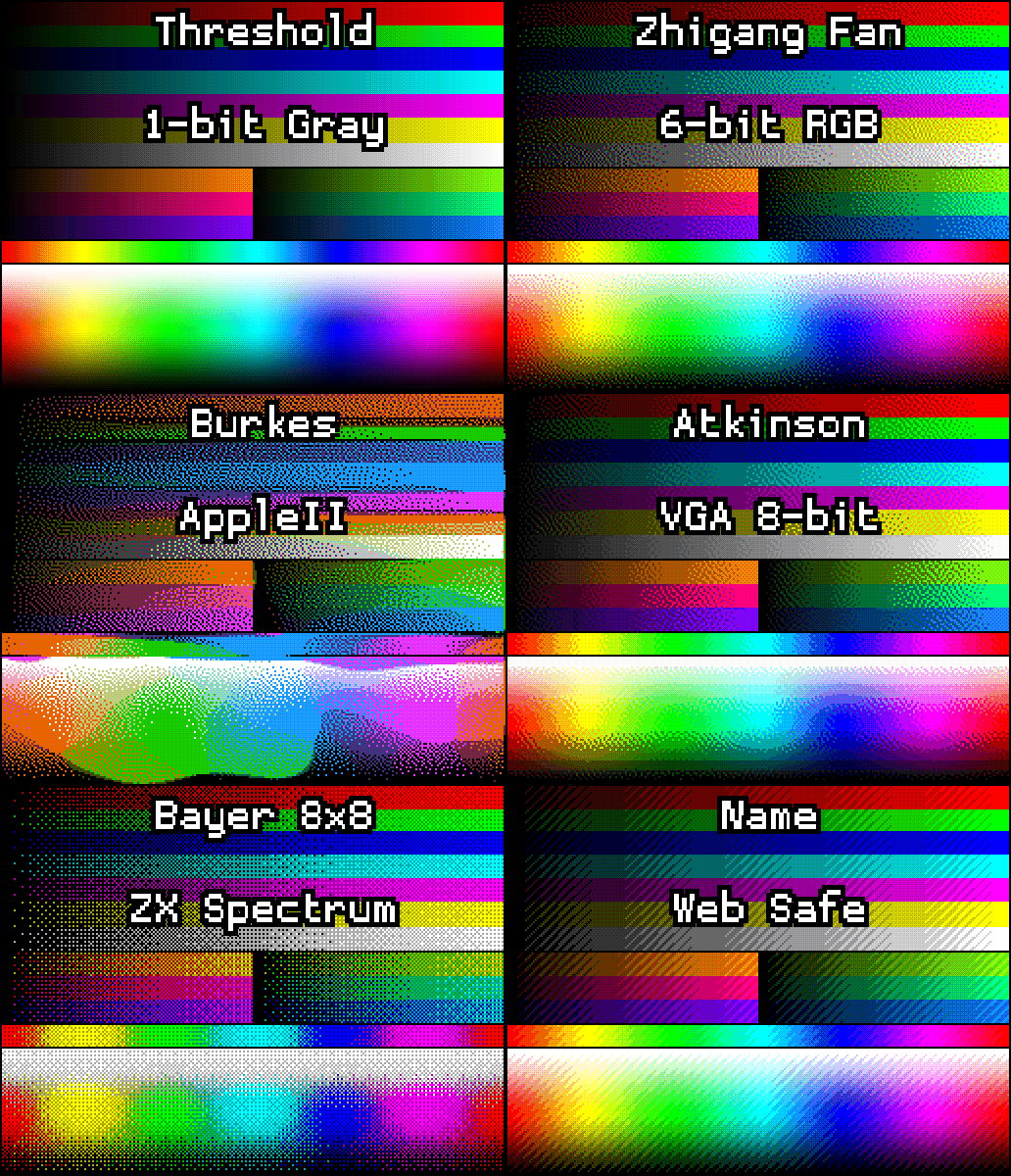
But again, it was not a straightforward process with a single magic "export" button and I had to do a lot of adjustments. I also had to simplify some camera moves that were causing unpleasant flashing like in this early intro below:

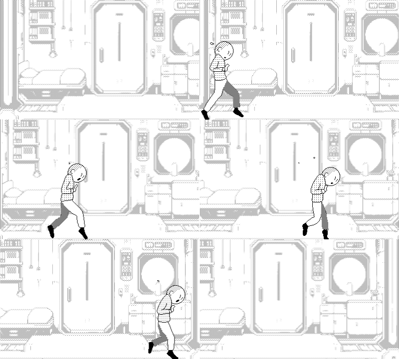
Slow zooms and pans will cause unpleasant pixel flashing
Less is more
A good rule of thumb is to avoid layering and animating too many elements, keeping things simple and easy to read.
Here's a little breakdown of the game over sequence.
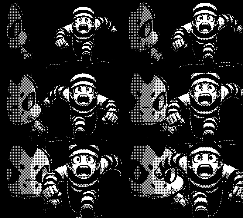
Rough animation in AE exported with pixDither
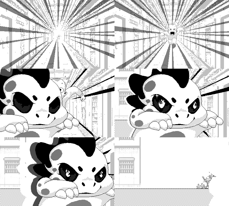
Slow zoom + dithered background didn't feel right
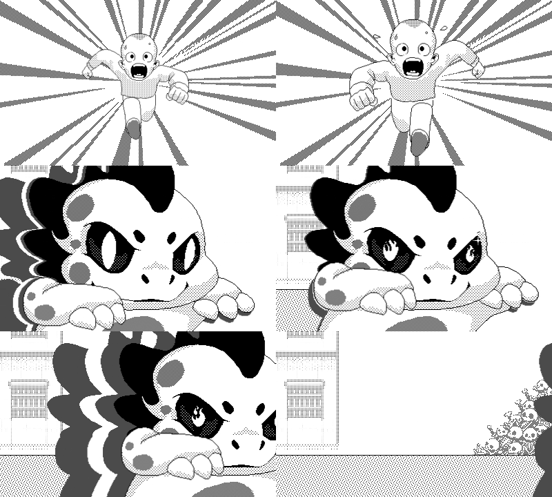
Final sequence
Get Don't Wake Roko
Don't Wake Roko
How many mortals will you free? 🦎🚪🏃➡️🏃➡️🏃➡️🏃➡️ A pick-up & crank game
| Status | Released |
| Author | 400x240 |
| Genre | Action |
| Tags | 1-bit, 1bit, pick-up-and-crank, Pixel Art, Playdate, playdate-game |
More posts
- 👹 Konami code anyone?May 01, 2024
- 🦎 Roko?Apr 24, 2024
- 🎶 Beyond ChiptunesApr 21, 2024
- 🧳 Exploring TypographyApr 20, 2024
- 💯 Crankin'Apr 20, 2024
- 👀 ObsessedApr 20, 2024

Leave a comment
Log in with itch.io to leave a comment.